A closer look at the FSG logo
Accompanying the re-design of the FSG website, we gave the logo an overhaul, as well.
The FSG was quite happy with the existing logo, so there wasn’t much room for change. But to create a cohesive look, we wanted to make the best of it, of course. Beware! Subtle details incoming.

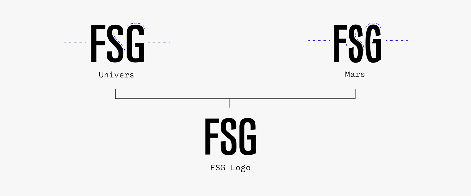
The old logo used Univers 59 Ultra Condensed. A great typeface from one of the best type designers of the 20th century. However, this designer, Adrian Frutiger, was known for the distinctly neutral character of his typefaces. Neutral typefaces are excellent for long running text where they are as unobtrusive as possible, but they don’t harmonize well with expressive typefaces, like Mars, which we used for the rest of the design. Why not use Mars, then? Good question! Unfortunately, we wouldn’t have hit the right tone with that either. Because Mars Condensed, which has similar proportions, is very lively – actually, much too lively for our intended use. In addition, the apertures are too closed to be used in a logo without any concern.
So both options were off the table, and we decided to combine the characteristics of the two fonts.

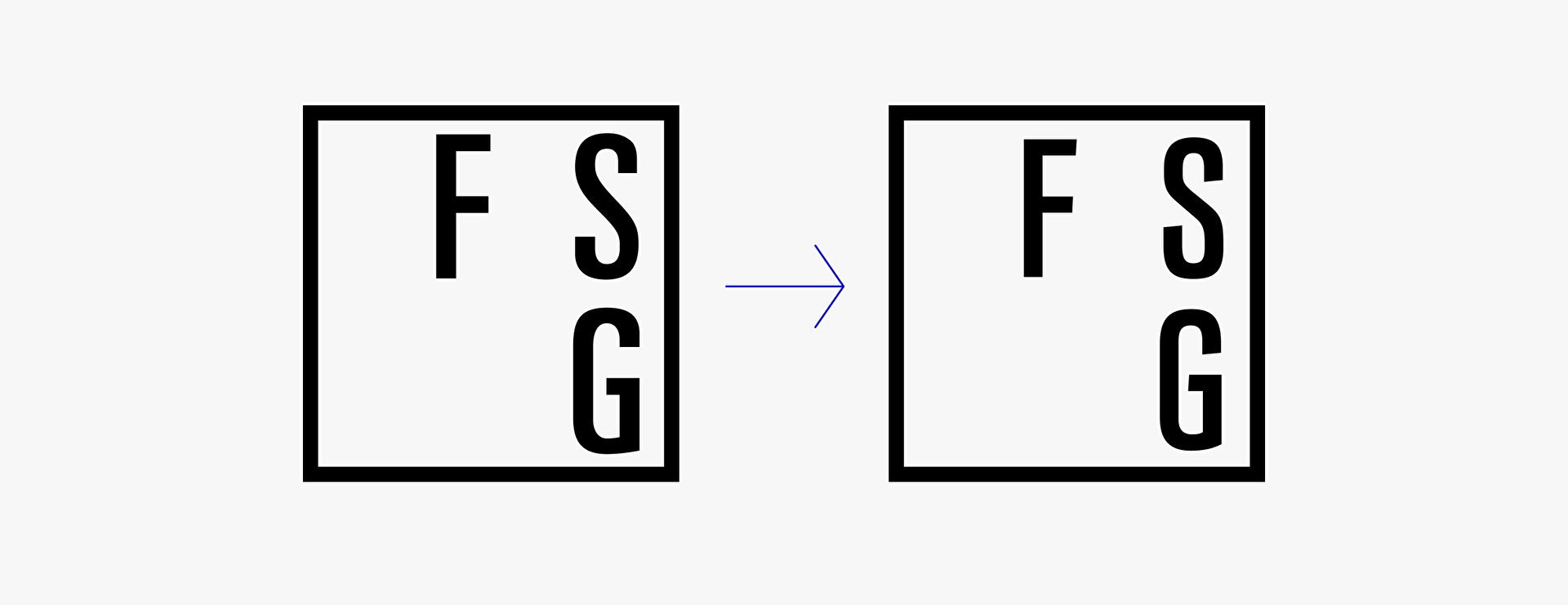
Drawing the new letters, we stayed close to the proportions and weight of Univers, but used the angled terminals of Mars. We raised the waistline slightly to maintain the retro vibe of Mars, and replaced the smooth flowing S-curve of Univers with the more angular motion of Mars. The apertures are now open enough to not clog in smaller sizes, but still more closed than in Univers. The negative spaces are now more angular than in either typeface, but much closer to those of Univers and also to Venus, the typeface on which Mars is based.

The original Venus Condensed Semi Bold, Bauersche Gießerei, 1907 (Source: archive.org)
That’s it. A few subtle changes for a more than subtle effect – and three confident letters that only exist in this logo.
But wait! I’ts not over yet. From the beginning, we saw the logo as a means to bring more movement to the site.
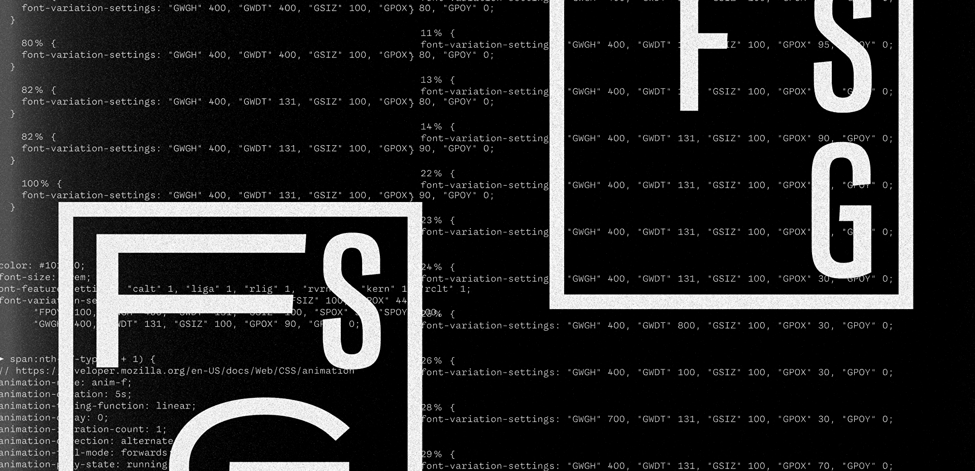
So we decided to create the logo as a variable font. Each letter needed to be able to be controlled independently of the others in terms of position, size, width and weight. Not such an easy task. In the end, 15 axes were necessary to achieve this. From Condensed to Ultra Extended and Light to Black, quite a wide range. But this way we had all the options we wanted to create a variety of css animations.

As a starting point, we prepared ten animations, but theoretically much more is possible. We see the logo as a playground for the FSG or the students, but also as a way to convey creativity and a sense of joy through the logo.
The animations are meant to be randomly selected and start playing whenever a subpage of the FSG website is accessed.