Bauer Grotesk 2.0
New characters, new languages, new features!
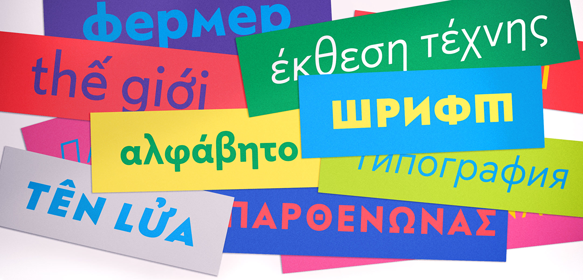
Almost exactly five years after the furious first appearance of Bauer Grotesk, we have extensively extended the font family. It now also supports Greek, Cyrillic and Vietnamese.
If you want to know why we did it and what it took to do it, read on – and consider making a cup of coffee first.
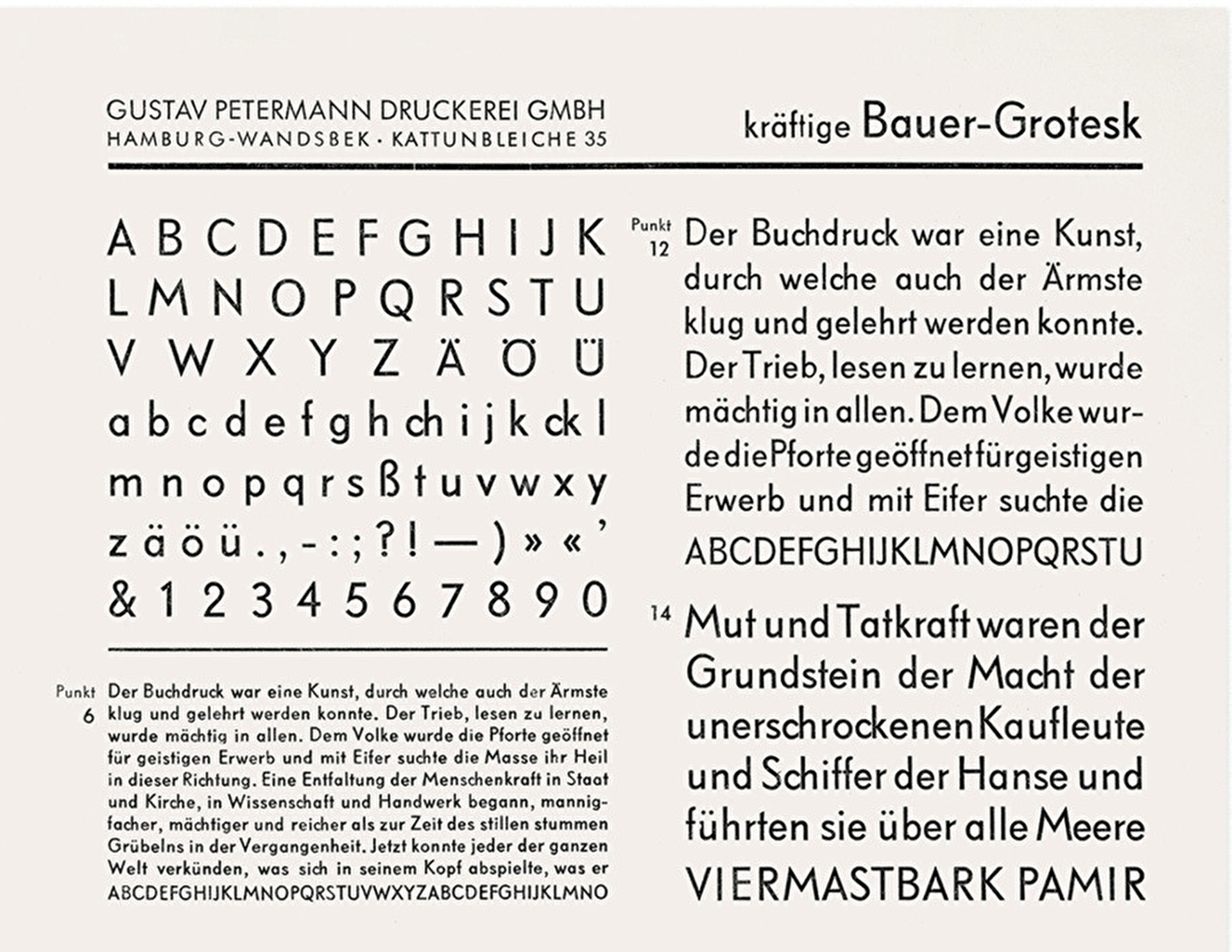
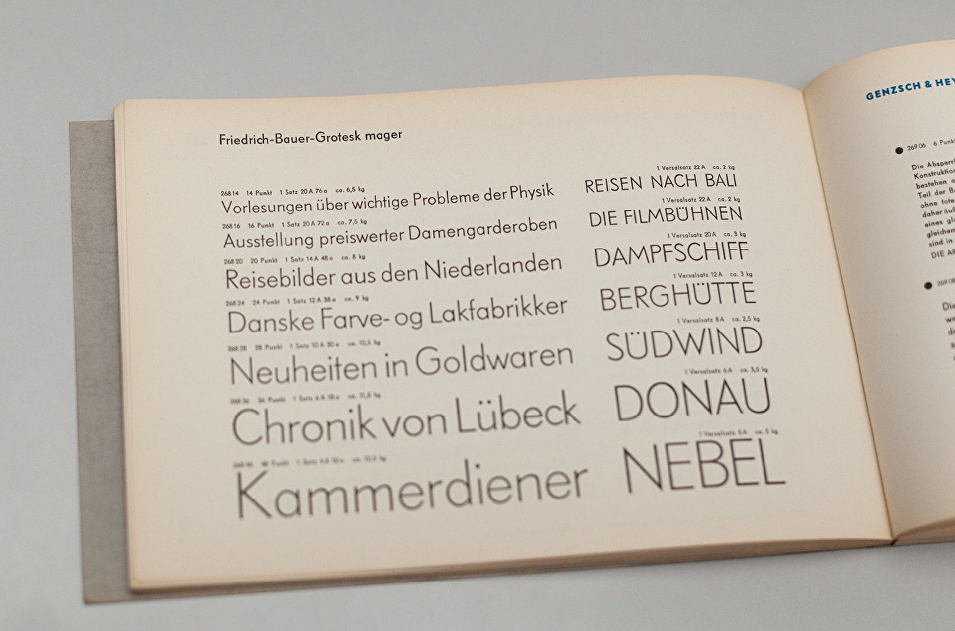
Friedrich Bauer Grotesk – the metal type Bauer Grotesk is based upon – had a rather limited character set. Not untypical for the 1930s, when the typeface was created. So right from the start we were confronted with the challenge of designing new characters in the style of the old ones. We found some ideas in Hamburger Grotesk (later Genzsch Grotesk), which was a further development of Friedrich Bauer Grotesk, even if it did not come close to its quality.
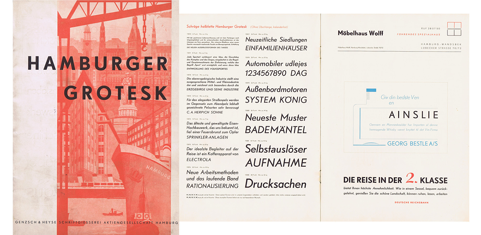
Hamburger Grotesk Specimen (Source: Museum of Work, Hamburg)
In 1946, after the war, the company Genzsch & Heyse took over Friedrich Bauer Grotesk from J.D. Trennert und Sohn and developed it further under a new name. The forms for the two-storey a or the M with straight legs originate from this typeface, for example.
The type of italics is also similar to that of the Hamburger Grotesk. Friedrich Bauer Grotesk itself was never offered with an italic.

Hamburger Grotesk Alternative shapes
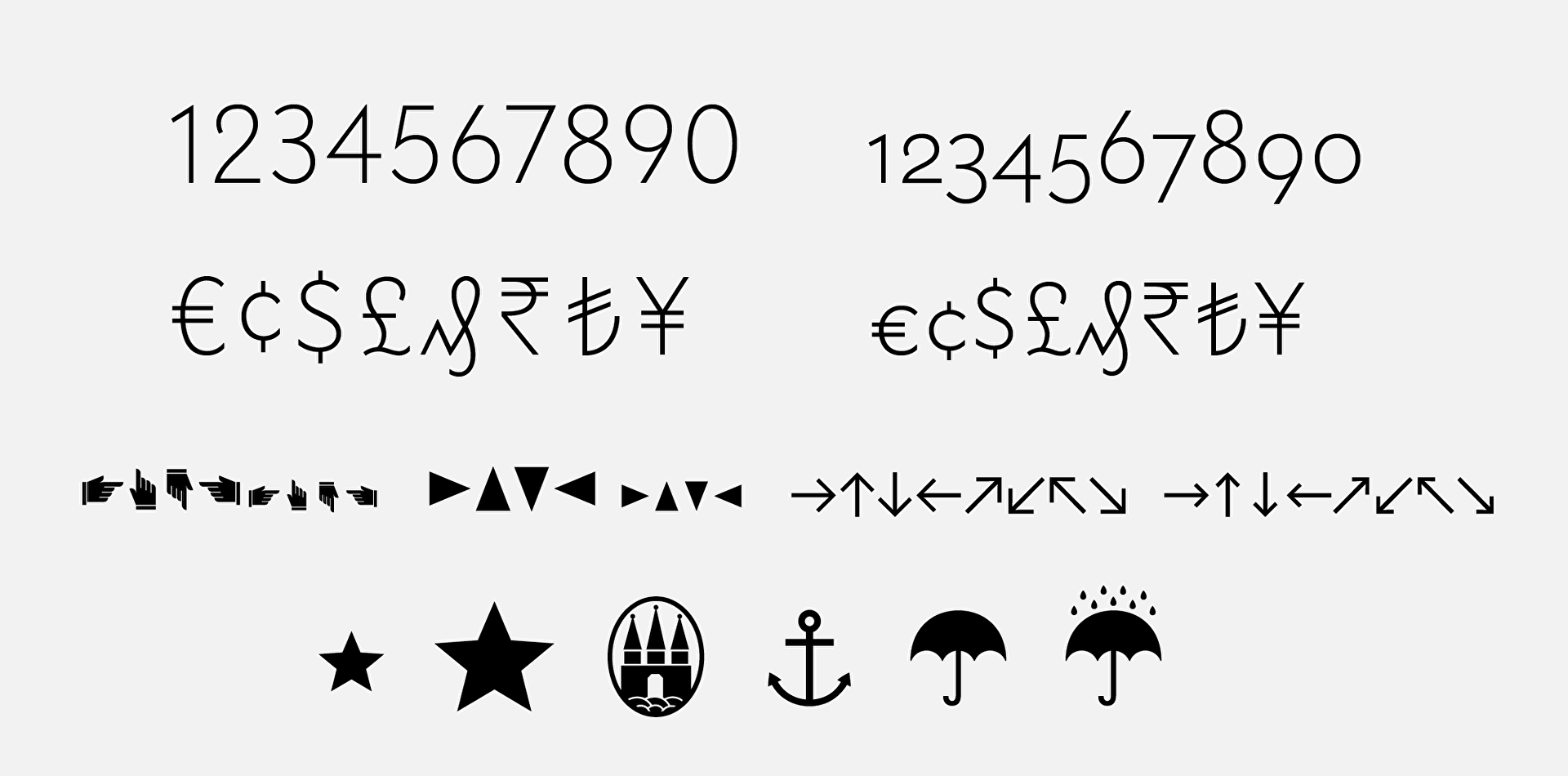
Many other characters, such as small caps, currency symbols, number variants, arrows, etc. had to be redrawn, if possible in such a way that they matched the style of the other characters. Not an easy task and for the time being it was enough for us, since the character set had already grown considerably to over 1300 glyphs.
Our self-control lasted until the end of 2015 and an episode of “The Americans”. Overwhelmed by the omnipresent Cyrillic letters, this thought slowly crept in: “Wouldn’t Bauer look good in Cyrillic, too?“ The question answered itself. Because it was actually already clear to us that Geometric Grotesques and Cyrillic are a very good match.
Down the Rabbit Hole
After some research, we were finally convinced by the idea and started working. Until we realized that the real goal of an extension should be a pan-European character set. So Greek appeared on our to-do list, too. Until we asked FontShop what they thought of the idea. Back came: “Good idea! But what about adding Vietnamese, too?” And all of a sudden our list had grown by another considerable entry.
What about adding Vietnamese, too?
We knew that we had to study the forms and languages intensively before we could start drawing letters for real. Fortunately, we were able to rely on the expertise of the renowned type designer Jovica Veljović, who gave us valuable feedback many times over.
Vietnamese
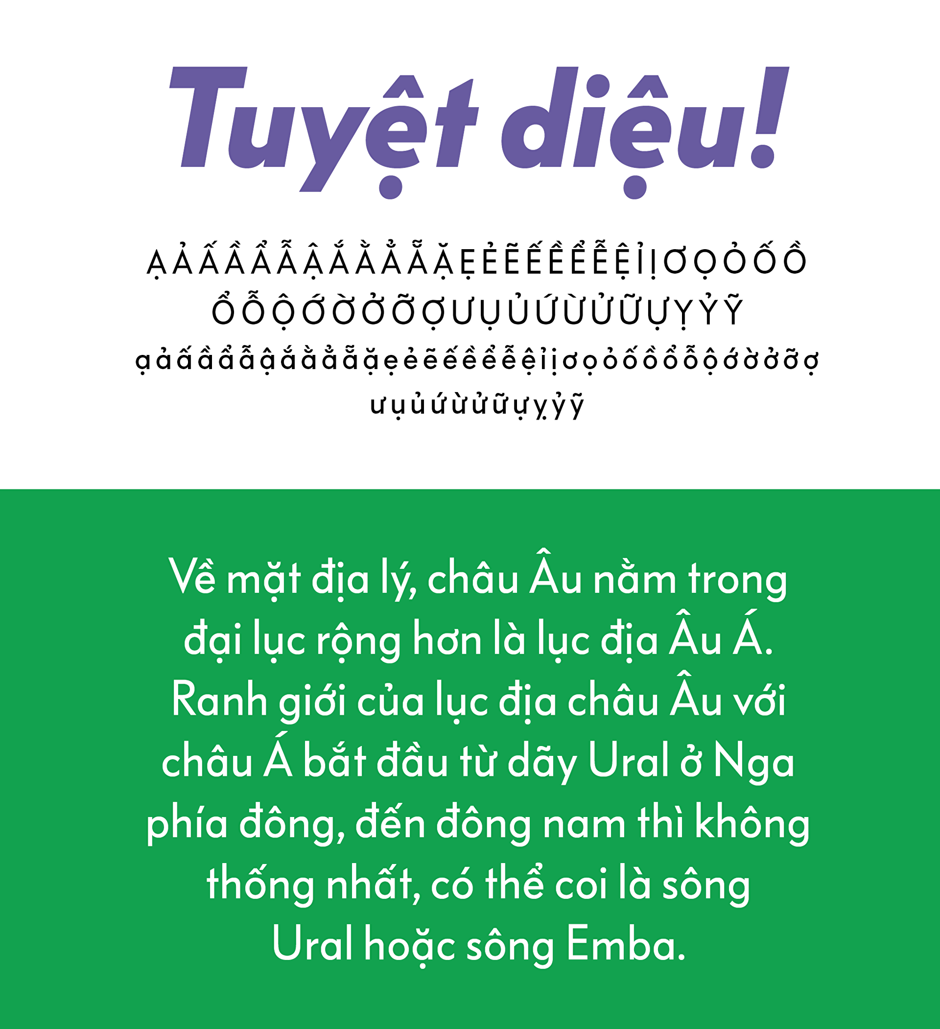
As we delved deeper and deeper into the world of Cyrillic and Greek letters, we began with the Vietnamese extension. Since these are merely new diacritics for existing Latin letters, we stayed on familiar terrain for the time being. Nevertheless, it was an interesting and challenging task to harmonize all new diacritics with each other and to fit them into the system of the existing ones. Of course, the double diacritics posed the biggest problem, as their height in particular should not be too high, but the individual parts should not be too small either. After a lot of testing and optimising we got a nice new set of diacritics and had realized that Vietnamese diacritics are probably the coolest of them all.
Cyrillic
The longer we studied the Cyrillic alphabet, the more we began to love it. At first glance, Cyrillic – especially in sans serif typefaces – always appears very blocky and coarse, with it’s many verticals and very few ascenders and descenders. But when you begin to read these languages, this first impression gives way to an unexpected, rough warmth. At least that’s how we felt. And that, of course, made it all the more enjoyable to work on these letters.
We were aiming for the sweet spot between a maximum of users and a manageable number of characters
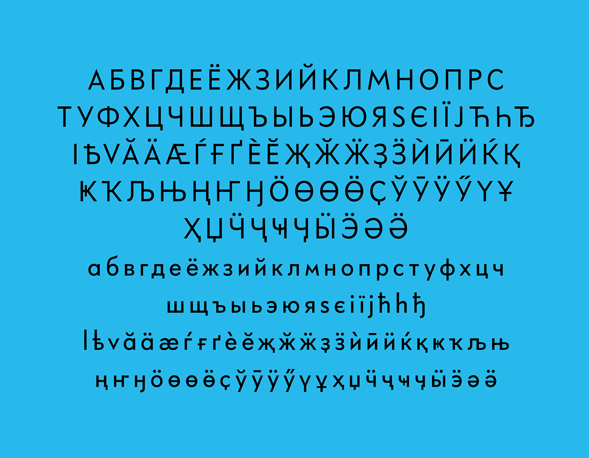
Since Cyrillic does not only contain Russian, but also several other languages, first of all we had to determine the range of characters. We were aiming for the sweet spot between a maximum of users and a manageable number of characters. In the end, we came up with 90 letters, almost twice as many as in the basic set, covering 51 languages.
x-Height of Evil
The low x-height, especially in the light weights, was not really our friend in Cyrillic. Letters like be or ef challenged us the most. With be it was difficult to fill the large space above the x-height without letting the letter appear unbalanced or like a 6. In other typefaces the problem is rather that this white space becomes too small if the lower part is not shortened. But Bauer is just a kind of its own... In addition to that, we had to shorten the ascender of the ef to avoid creating too much imbalance with the descender.

Final version of the letters ef and be in light und bold
Cyrillic Italic
In many typefaces, some Cyrillic characters change their shape in the italics. This construction is closer to the writing form and more natural. For Bauer Grotesk, we had to consider whether we wanted to go down this path. We decided against it and followed the style of the Latin italic, which was also designed as an oblique in the original – so no changes in shape are made here, as is commonly done with a, e or g, for example.
This seemed to be a better fit with the original and, in our opinion, this should always be one of the most important factors in a revival.

Oblique Construction of italics in Latin and Cyrillic letters
Lokalisierung
Bulgaria, Serbia and Macedonia use the Cyrillic alphabet, but in some characters the forms differ, especially in Bulgarian. Of course, these locally influenced form variants should not be missing in Bauer Grotesk.

Alternativen
We have created a Stylistic Set for the Cyrillic Te. Especially in a geometric grotesque this version works very well and makes the appearance of the font a bit more blocky and constructed. If you want to push this even further, you should use the Titling Feature and switch De/de and El/el to the geometric variants.

Cyrillic alternates Titling Feature and Stylistic Set 12
Greek
Most Greek capitals share their form with the Latin ones. The lower case is more exciting. The first challenge with the Greek letters was to decide how geometric they could become without turning abstract. Here, too, we first sought for the answer in the original. In some letters, such as o or n, Bauer Grotesk is rather humanistic, i.e. not so radically geometric. Other letters like the t on the other hand are very strict. Overall, there is an interesting tension between dynamic and static/constructed. We had already worked this out in the first release. In the default version the font is rather geometric, but with Stylistic Set 3 you can emphasize the humanistic side of the font in the OpenType settings.
The first challenge with the Greek letters was to decide how geometric they could become without turning abstract
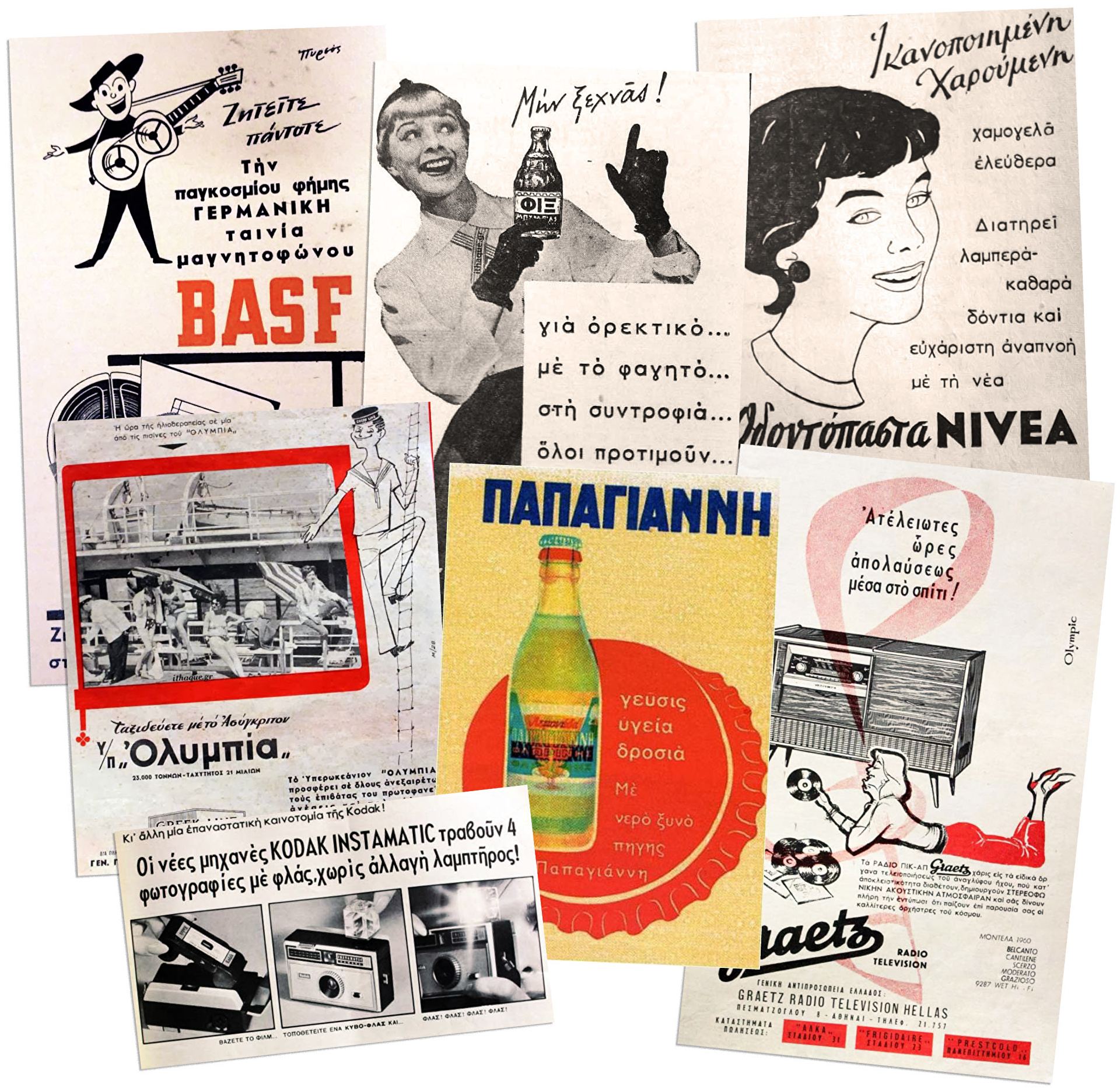
So far so good, but what does that mean in particular for the Greek alphabet? In order to make a final decision, we had to research Greek prints a little deeper and study geometric typefaces from the 1930s and 40s.
Research material
First example: pi.
Two variants dominated the historical typefaces. The very reduced rectangle version and the somewhat clearer version with the accentuated horizontal. The second version was much more common and probably rightly so. But for this we opted for the reduced version. This construction felt more like Bauer. Like the t, it is not the most readable version, but helps to maintain the tension between geometry and dynamics.
In Stylistic Set 3 you can switch the pi and some other characters to a more dynamic version if you like.
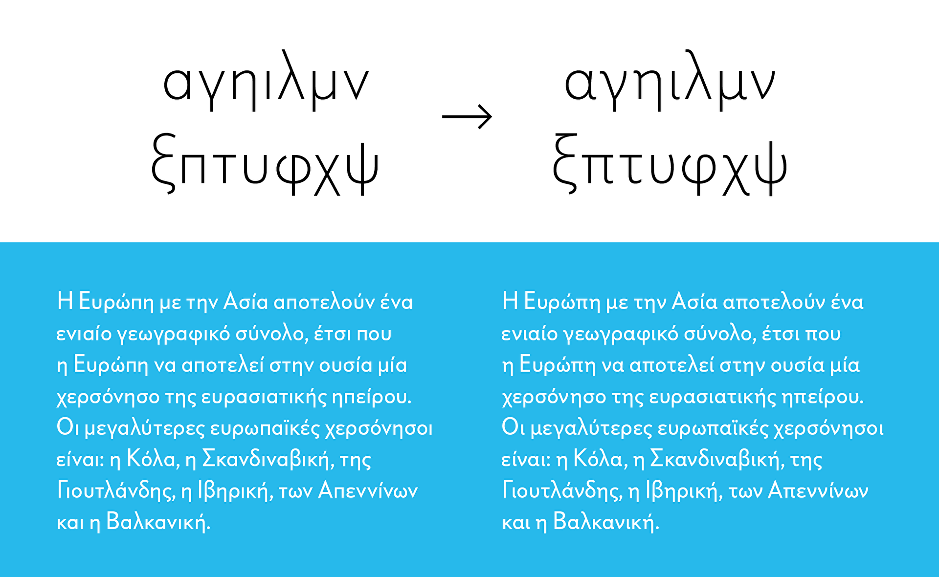
Stylistic Set 3 Effect of the dynamic alternates
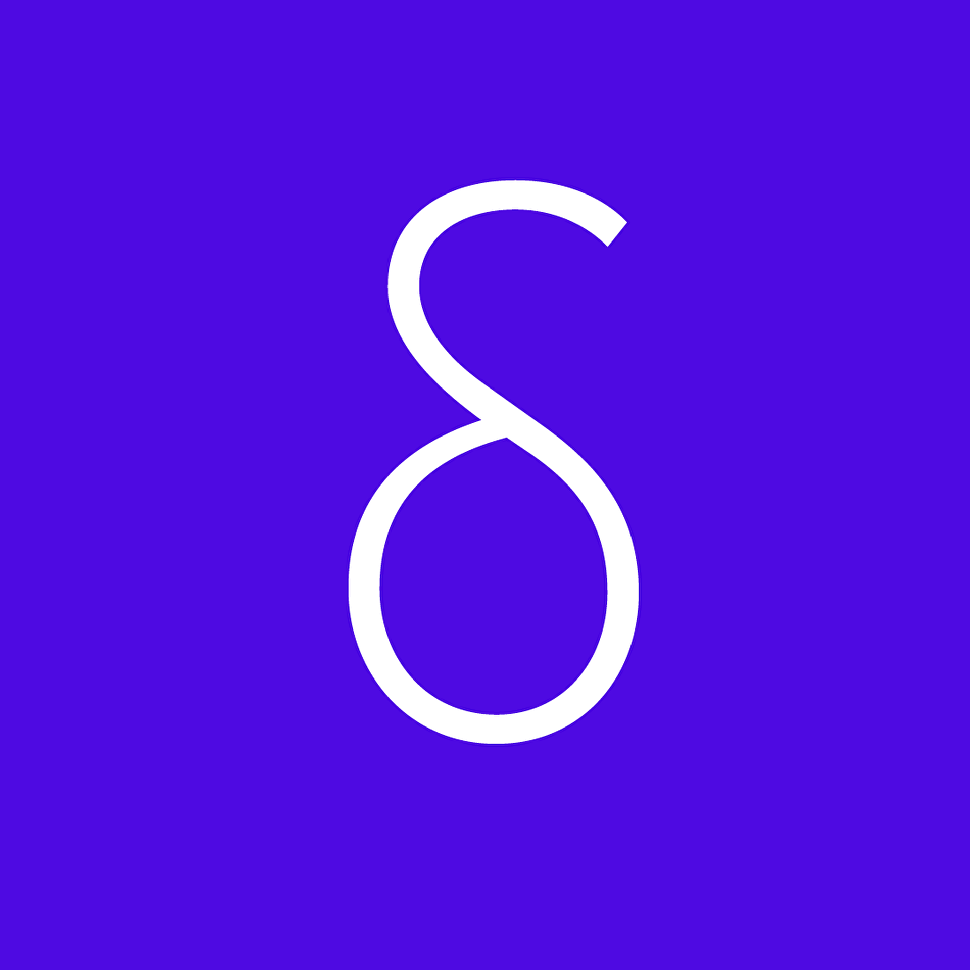
Second example: delta.
The top can be straight or curved. Both occur in the historical sources. Here, contrary to the pi, we have opted for the softer, curved shape. The font was supposed to be predominantly geometric, but not too hard. We had the feeling that this would have happened with the horizontal terminal. In addition, the curved version was more compatible with the low x-height.
beta, theta and gamma
In our source material beta, gamma and theta very frequently had shapes, that are rarely used today, especially in geometric grotesques. We liked these shapes but in the default version these characters would have been too unfamiliar for today’s readers – Stylistic Set 14 to the rescue.
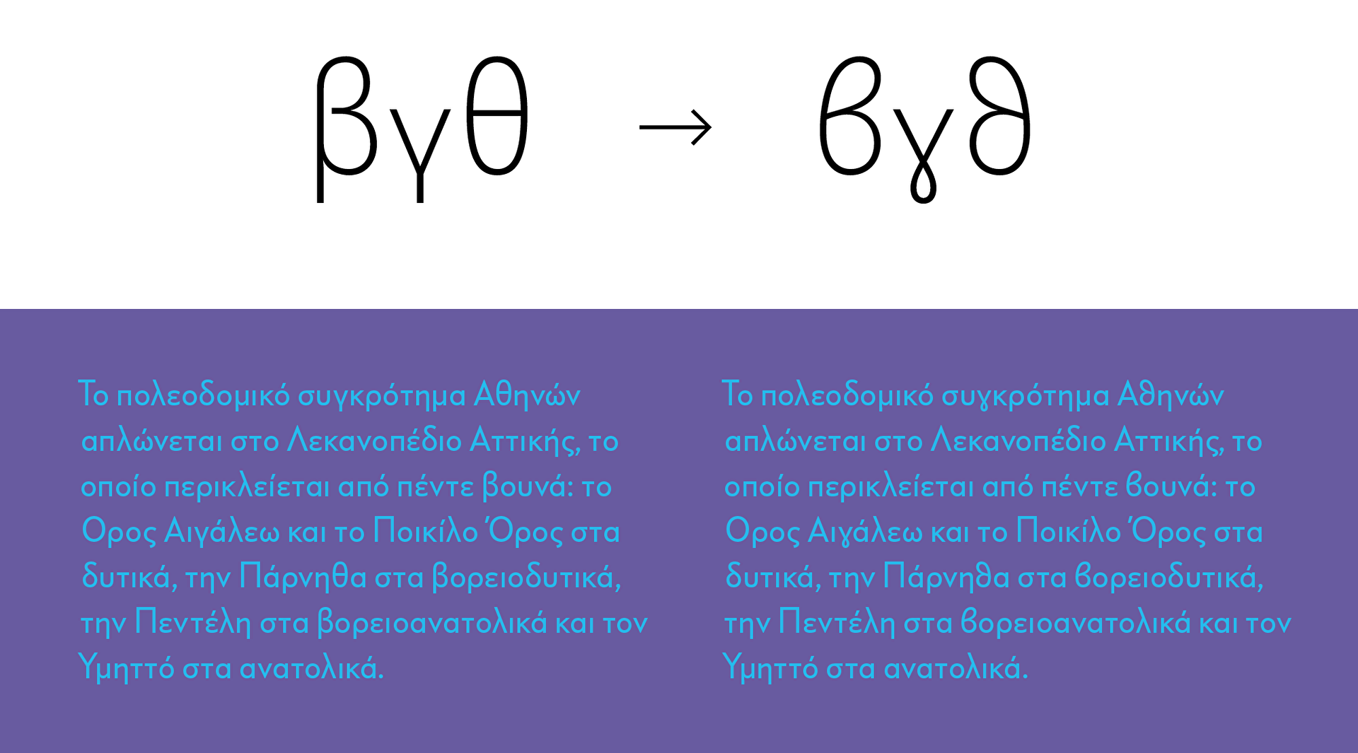
Alternates for beta, gamma and theta
Stylistic Set 12 M, Em and Mu
New M
The Latin language system got a little treat, too. Since we were asked quite frequently whether we could offer an M with straight legs, we included it in this release. Advantage: The form of the M is also available in Cyrillic (Em and em) and Greek (Mu). One M to rule them all, so to say. Find the new M in Stylistic Set 12.
And finally we added the necessary currency symbols for the new languages before we started kerning. This took a lot of time, since the character set had reached about 2400 characters – in other words, it had almost doubled.
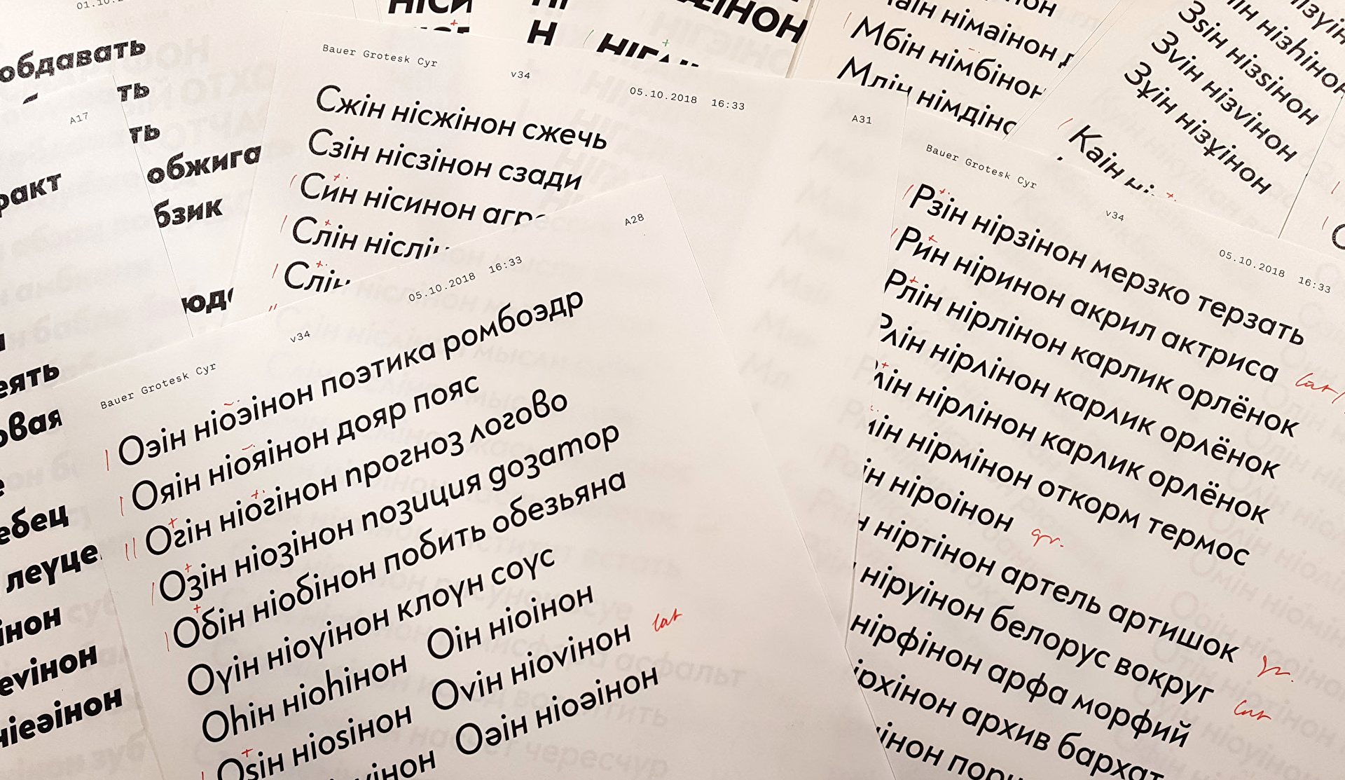
Proofs Kerning, kerning, kerning
In the end, we were happy that we had not only brought a typeface into the 21st century, but also made it available to significantly more people than ever before. As a bonus, we’ve learnt an incredible amount – in addition to the new language systems, a whole range of vocabulary, because without being able to read the letters, it’s hard to design them.
We are looking forward to seeing the new Bauer Grotesk in use.