Bauer Grotesk
FF Bauer Grotesk is a revival and extension of the metal typeface Friedrich-Bauer-Grotesk, that originated in 1934 in Hamburg, Altona. We found this gem in an old specimen book and had to start the revival process right away. It would have been too big a loss to let it fade away.
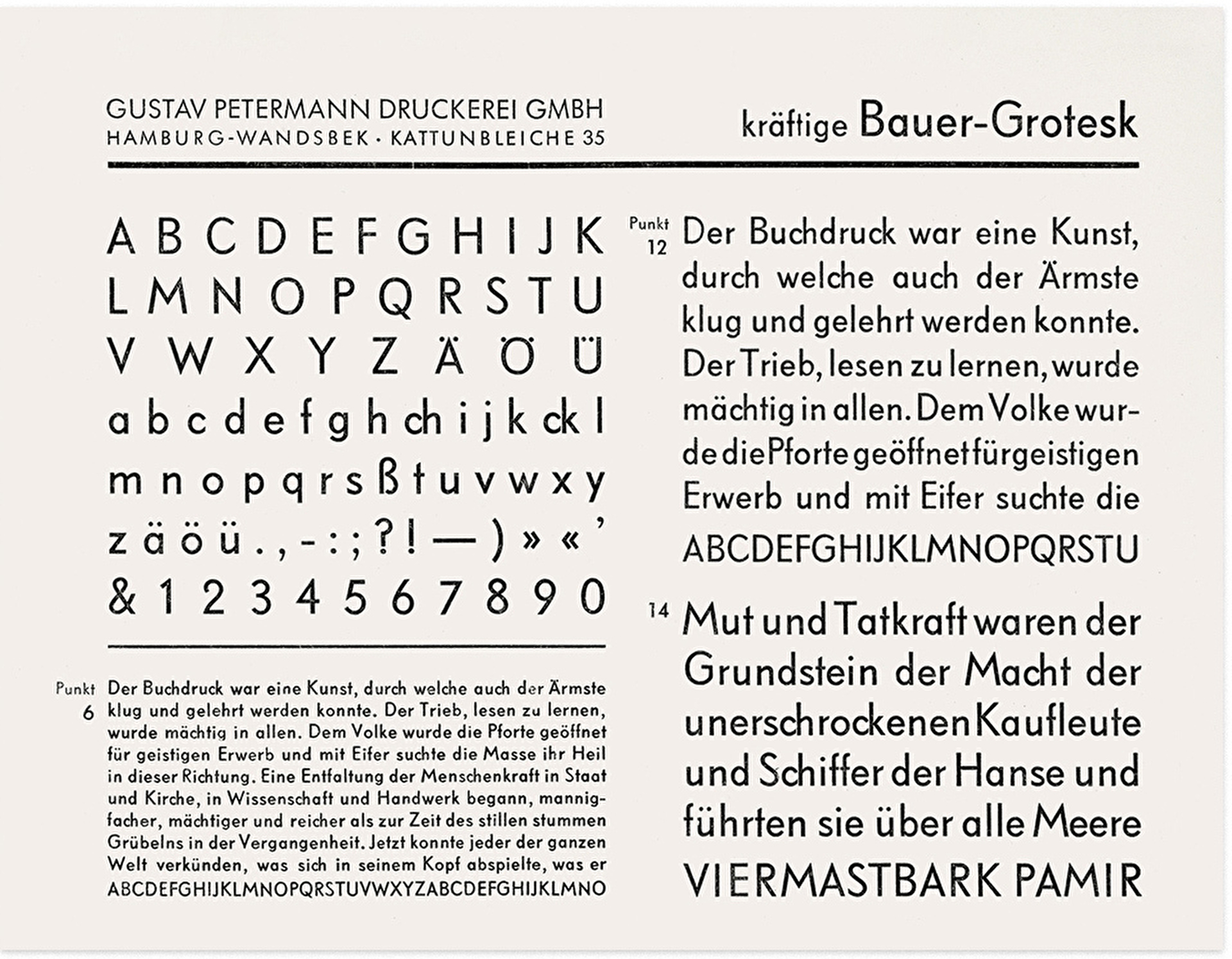
The original was drawn in the midst of a wave of geometric grotesques in the beginning of the 1930s, like Futura, Erbar or Elegant Grotesk. It is similar in it’s constructed appearance but surprisingly different in some very characteristic shapes, resulting in a livelier design. The oval O is a good example, as well as the M with diagonal legs or the dynamic shapes of m and n.
Design
We always kept as close to the design language of the original as possible. Continuously repeating the mantra: “What would Friedrich do”.
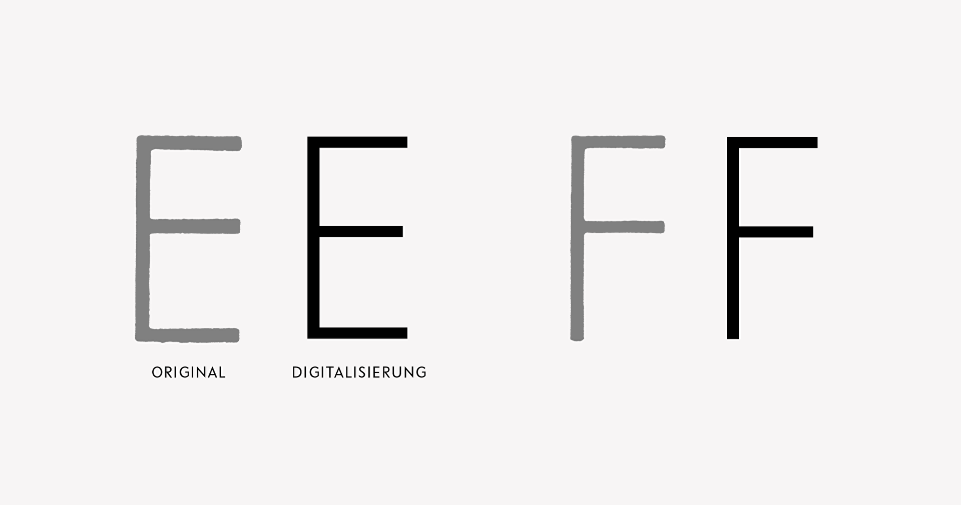
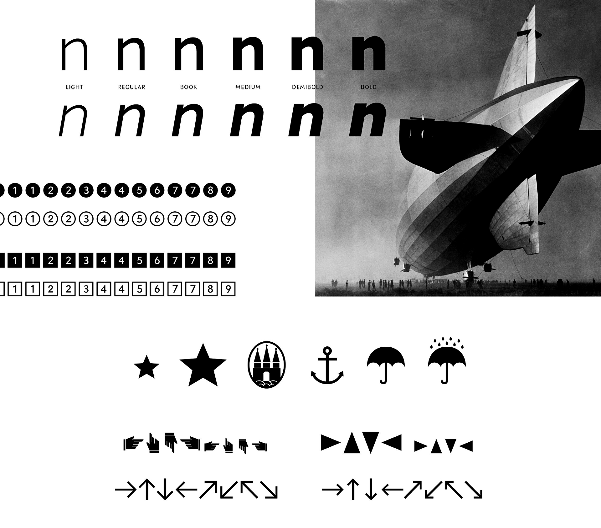
The typeface consists of six weights with accompanying italics. The digitization was based on the light and bold weight of original test prints. The remaining weights were added in respect of the original weights. The italic was drawn from scratch as an oblique.
Features
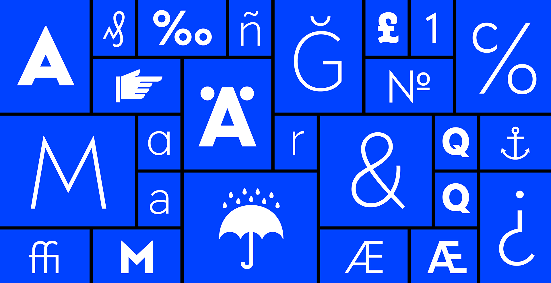
Apart from the typical OpenType features like small caps or superiors and inferiors, a range of alternate characters completes the typeface. So that the historical charme could be maintained in the basic version and a more contemporary feel could be evoked as well.

The bold weight with and without alternates
Use cases
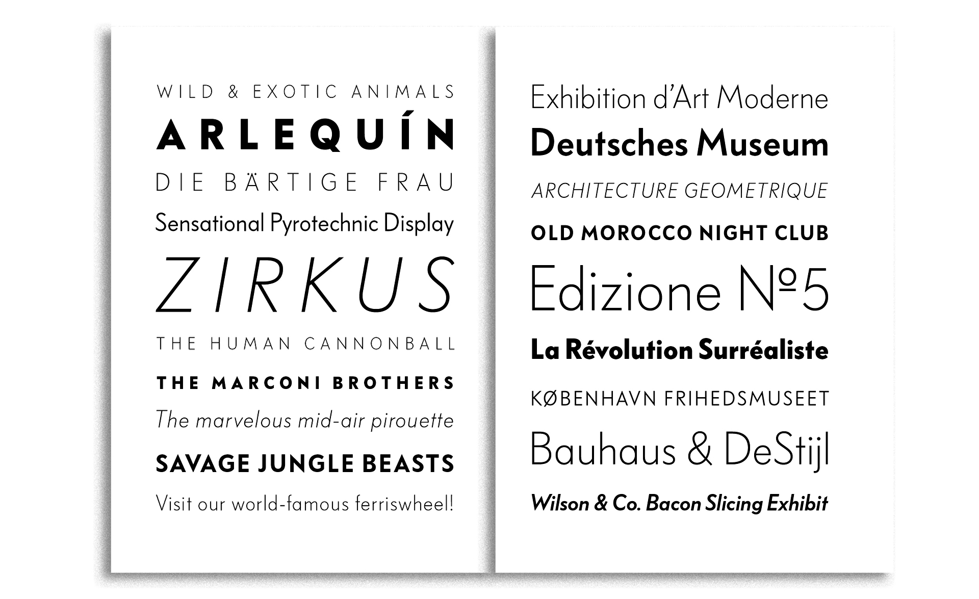
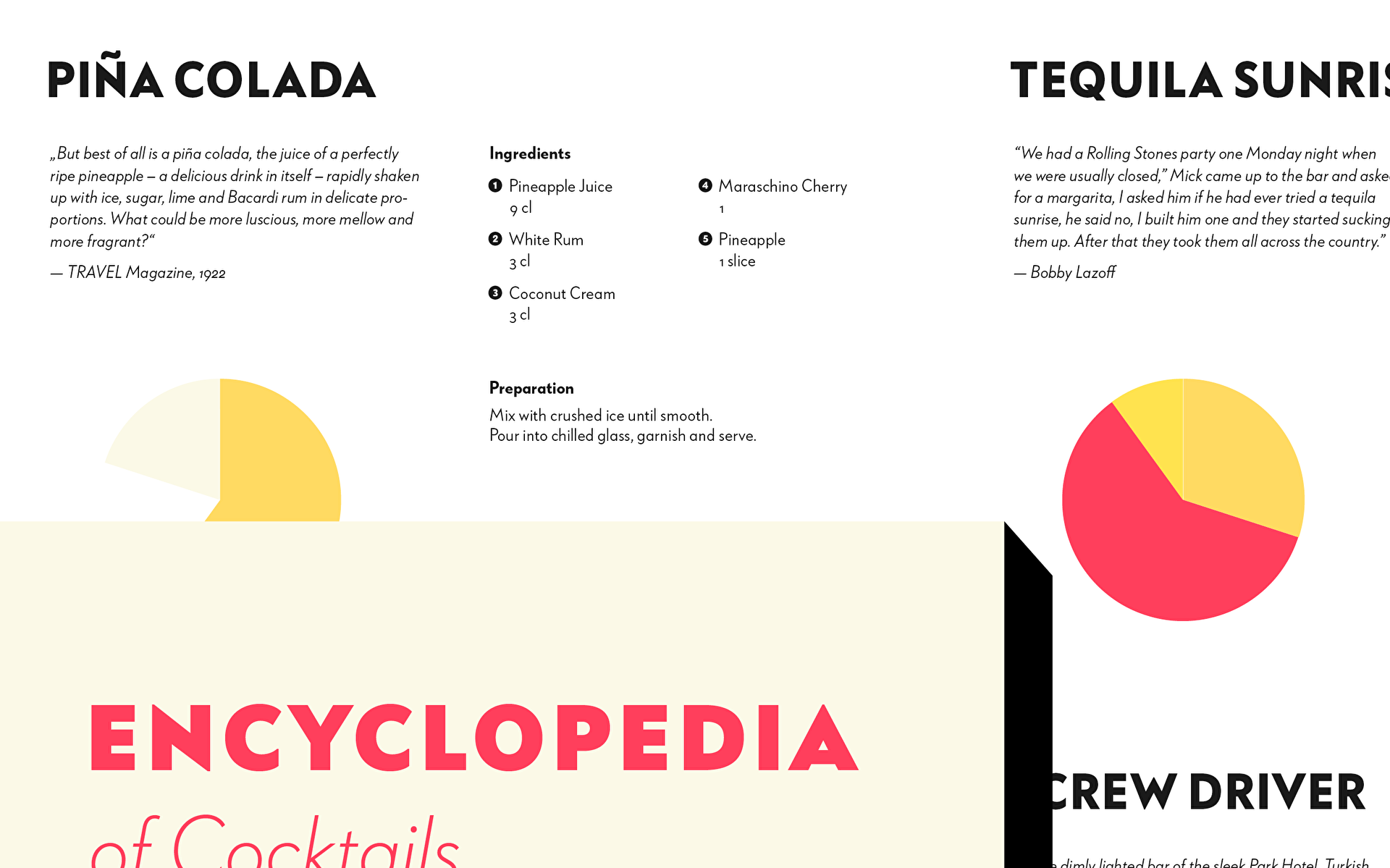
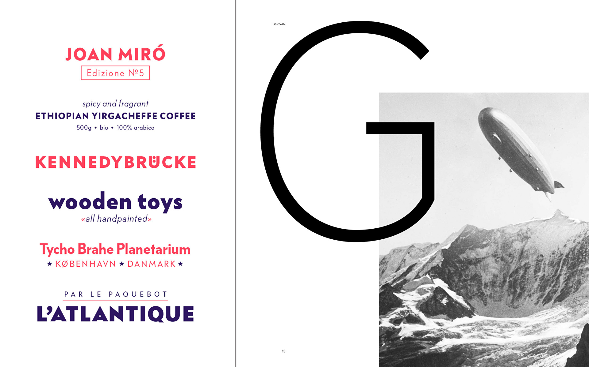
The best way to get a feel for the typeface is to see it in use.
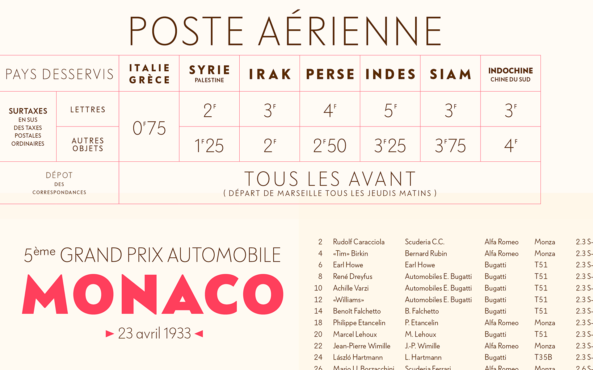
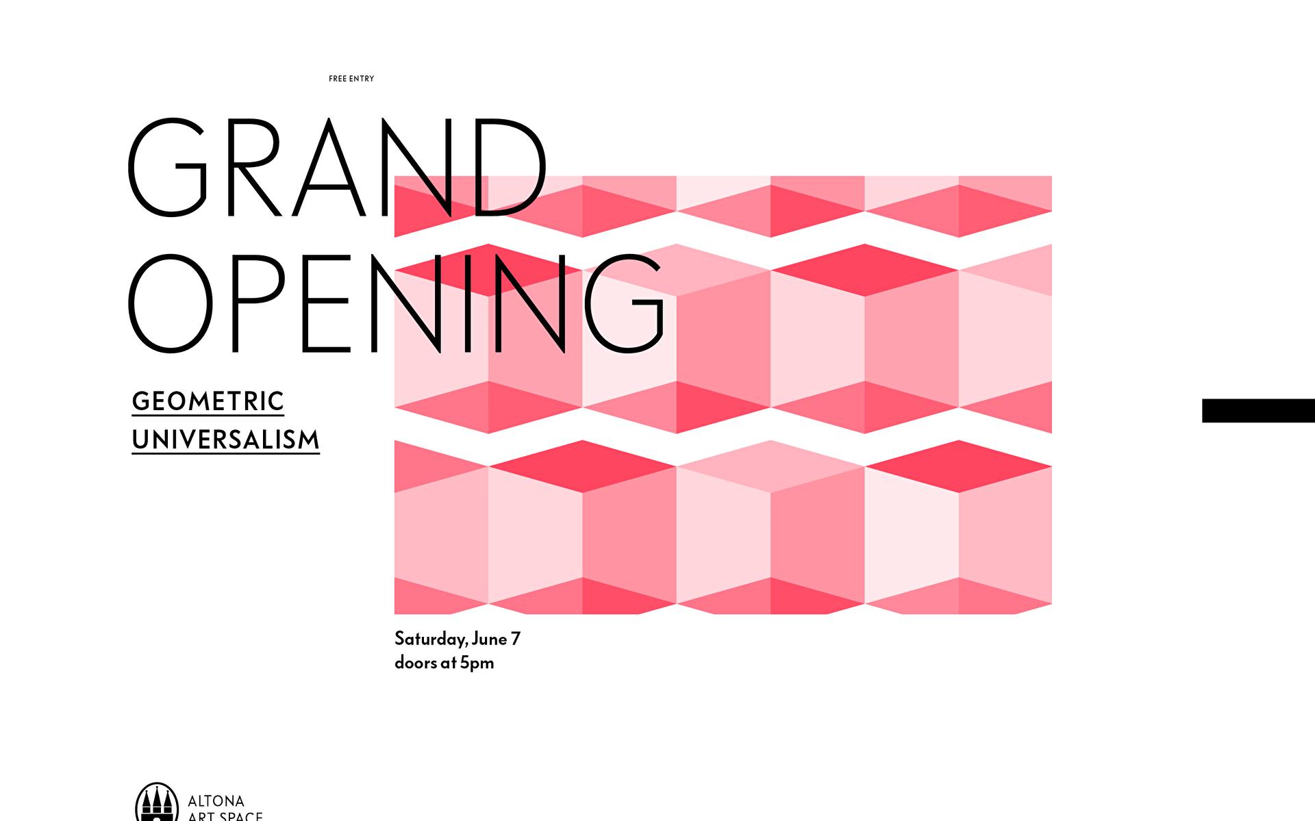

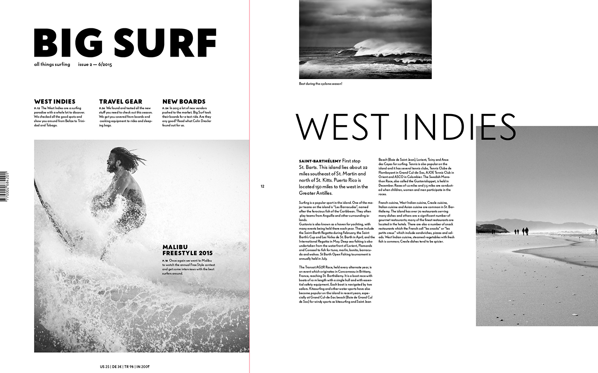

Since 2017 Bauer Grotesk is the official signage typeface of the train station in Altona. That means the typeface returned to its place of origin after more than 80 years. This makes us especially happy! More info in the blog.
